ShopDreamUp AI ArtDreamUp
Deviation Actions


Suggested Deviants


Suggested Collections
![BlueVision V0.2 Alpha [RAINMETER]](https://images-wixmp-ed30a86b8c4ca887773594c2.wixmp.com/i/f8a7966e-6db1-4413-b8db-95bb5b660abb/d2oqh0a-c9a10f18-d4b6-479c-a59a-0d7656df2163.png/v1/crop/w_184,h_184,x_36,y_0,scl_0.17037037037037/bluevision_v0_2_alpha__rainmeter__by_g3xter_d2oqh0a-92s-2x.png)
![BlueVision V0.2 Alpha [RAINMETER]](https://images-wixmp-ed30a86b8c4ca887773594c2.wixmp.com/i/f8a7966e-6db1-4413-b8db-95bb5b660abb/d2oqh0a-c9a10f18-d4b6-479c-a59a-0d7656df2163.png/v1/crop/w_92,h_92,x_18,y_0,scl_0.085185185185185/bluevision_v0_2_alpha__rainmeter__by_g3xter_d2oqh0a-92s.png)


You Might Like…


Description
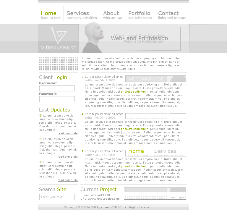
In my actual journal [link] I write that the first version for vitreousPULSE is coming soon. And I'll give you a little preview version of it. The content is only a preview and not the finished view for that part of the site. I have much ideas to give the content the main-part in the finished layout.
The Logo is also only a preview, I try at the moment with much things to get the best logo for me in future. And the stockphoto in the header is from sxc.hu ...
* Fullview is a must !
Hope you'll like the layout and you can give me a lot of comments to the layout.
Copyright © by vitreousPULSE, don't use parts or the complete image without my permission.
Image size
768x710px 66.86 KB
© 2006 - 2024 shftfrm
Comments27
Join the community to add your comment. Already a deviant? Log In
Definitely a good start. Could use some vibrant colors and contrast, keep updating it  (Smile)")